Interactive Graphs in R
These are examples related to the Interactive Data Visualization with Plotly course on DataCamp
if (!require("dplyr")) install.packages("dplyr")
library(dplyr)
library(plotly)
library(rattle)
1 Static Graph 1
head(wine)library(ggplot2)
g <- wine %>% ggplot(aes(Flavanoids, Proline, color = Type, size = Hue)) +
geom_point()
g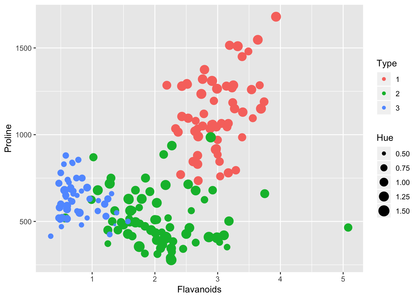
2 Interactive Graph 1
ggplotly(g)3 Static Graph 2
ggplot(wine, aes(Phenols, fill = "red")) +
  geom_bar(binwidth = 0.15)
## Warning: `geom_bar()` no longer has a `binwidth` parameter. Please use
## `geom_histogram()` instead.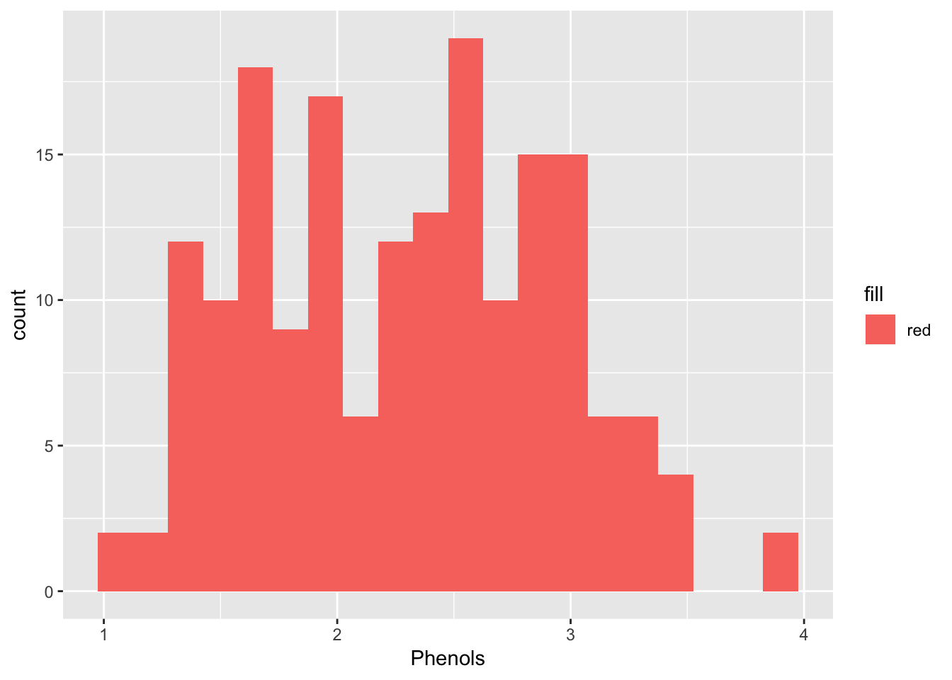
4 Interactive Graph 2
wine %>%
  plot_ly(x = ~Phenols, hoverinfo = "y") %>%
  add_histogram(opacity = 0.7, color = I("pink"), nbinsx = 25)
5 Data Wrangling
# Data Citation:
# P. Cortez, A. Cerdeira, F. Almeida, T. Matos and J. Reis.
# Accessed from UCI website.
# Modeling wine preferences by data mining from physicochemical properties. In Decision Support Systems, Elsevier, 47(4):547-553, 2009.
winequality <- read.csv("winequality-red.csv",header = TRUE,sep = ";")
#str(winequality)

winequality$type <- "red"


winequality2 <- read.csv("winequality-white.csv", header = TRUE, sep = ";")
#str(winequality2)

winequality2$type <- "white"

totalwine <- rbind(winequality, winequality2)

totalwine$type <- factor(totalwine$type)

str(totalwine)
## 'data.frame': 6497 obs. of 13 variables:
## $ fixed.acidity : num 7.4 7.8 7.8 11.2 7.4 7.4 7.9 7.3 7.8 7.5 ...
## $ volatile.acidity : num 0.7 0.88 0.76 0.28 0.7 0.66 0.6 0.65 0.58 0.5 ...
## $ citric.acid : num 0 0 0.04 0.56 0 0 0.06 0 0.02 0.36 ...
## $ residual.sugar : num 1.9 2.6 2.3 1.9 1.9 1.8 1.6 1.2 2 6.1 ...
## $ chlorides : num 0.076 0.098 0.092 0.075 0.076 0.075 0.069 0.065 0.073 0.071 ...
## $ free.sulfur.dioxide : num 11 25 15 17 11 13 15 15 9 17 ...
## $ total.sulfur.dioxide: num 34 67 54 60 34 40 59 21 18 102 ...
## $ density : num 0.998 0.997 0.997 0.998 0.998 ...
## $ pH : num 3.51 3.2 3.26 3.16 3.51 3.51 3.3 3.39 3.36 3.35 ...
## $ sulphates : num 0.56 0.68 0.65 0.58 0.56 0.56 0.46 0.47 0.57 0.8 ...
## $ alcohol : num 9.4 9.8 9.8 9.8 9.4 9.4 9.4 10 9.5 10.5 ...
## $ quality : int 5 5 5 6 5 5 5 7 7 5 ...
## $ type : Factor w/ 2 levels "red","white": 1 1 1 1 1 1 1 1 1 1 ...totalwine <- totalwine[c(1:11,13,12)]
totalwine$quality <- as.character(totalwine$quality)6 Interactive Graph Bars
totalwine %>%
  count(type, quality) %>%
  plot_ly(x = ~type, y = ~n, color = ~quality) %>%
  add_bars() %>%
  layout(barmode = "stack")
for (x in 1:nrow(totalwine)){
if (totalwine$quality[x] == "9" | totalwine$quality[x] == "8" | totalwine$quality[x]== "7"){
totalwine$quality[x] <- "High"
}else if (totalwine$quality[x] == "3" | totalwine$quality[x] == "4" | totalwine$quality[x] == "5"){
totalwine$quality[x] <- "Low"
}else{
totalwine$quality[x] <- "Medium"
}
}
totalwine$quality <- factor(totalwine$quality, ordered = TRUE,levels = c("Low", "Medium", "High"))7 Interactive Graph 3 Proportions
totalwine %>%
  count(type, quality) %>%
  group_by(type) %>%
  mutate(prop = n / sum(n)) %>%
  plot_ly(x = ~type, y = ~prop, color = ~quality) %>%
  add_bars(opacity = 0.5) %>%
  layout(barmode = "stack")
8 Interactive Scatter Plot
totalwine %>%
  filter(residual.sugar > 15 & residual.sugar < 30 & fixed.acidity > 5.5 & fixed.acidity < 9) %>%
  plot_ly(x = ~residual.sugar, y = ~fixed.acidity, symbol = ~quality ) %>%
  add_markers(marker = list(opacity=0.5, size = 10))
9 Interactive Bar Chart
totalwine %>%
  plot_ly(x = ~quality, y = ~alcohol) %>%
  add_boxplot()
10 Interactive Graph
wine %>%
  plot_ly(x = ~Flavanoids, y = ~Alcohol, symbol = ~Type, hoverinfo = "text",
          text = ~paste("Flavanoids: ", Flavanoids, "<br>", "Alcohol: ", Alcohol, "<br>", "Phenols: ", Phenols)) %>%
  add_markers(colors = c("orange", "green", "blue"), marker = list(size = 12, opacity = 0.5)) %>%
  layout(xaxis = list(title = "Flavanoids Conc.", type = "log"),
         yaxis = list(title = "Alcohol Percentage"),
         title = "Title Here")
11 Interactive Graph Customize Grid
rands <- sample_n(totalwine, 1000)

rands %>%
  plot_ly(x = ~free.sulfur.dioxide, y = ~total.sulfur.dioxide) %>%
  add_markers(marker = list(opacity = 0.5)) %>%
  layout(xaxis = list(title = "Free SO2 (ppm)", showgrid = FALSE),
         yaxis = list(title = "Total SO2 (ppm)"),
         paper_bgcolor = toRGB("grey90"),
         plot_bgcolor = toRGB("pink"))
12 Adding Layers (Smoother)
m <- loess(total.sulfur.dioxide ~ free.sulfur.dioxide, data = rands, span = 1.5)
pol <- lm(total.sulfur.dioxide ~ poly(free.sulfur.dioxide, 2), data = rands)

rands %>%
  plot_ly(x = ~free.sulfur.dioxide, y = ~total.sulfur.dioxide) %>%
  add_markers(showlegend = FALSE) %>%
  add_lines(y = ~fitted(pol), name = "Polynomial") %>%
  add_lines(y = ~fitted(m), name = "LOESS")
13 Density Layering
d1 <- filter(rands, type == "white")
d2 <- filter(rands, type == "red")

density1 <- density(d1$citric.acid)
density2 <- density(d2$citric.acid)

plot_ly(opacity = 0.5) %>%
  add_lines(x = ~density1$x, y = ~density1$y, name = "white", fill = 'tozeroy') %>%
  add_lines(x = ~density2$x, y = ~density2$y, name = "red", fill = 'tozeroy') %>%
  layout(xaxis = list(title = 'Citric.acid', showgrid = FALSE),
         yaxis = list(title = 'Density'))
14 Subplots
p1 <- wine %>%
  filter(Type == c(3)) %>%
  plot_ly(x = ~Alcohol, y = ~Malic) %>%
  add_markers(name = ~Type)

p2 <- wine %>%
  filter(Type == c(1,2)) %>%
  plot_ly(x = ~Alcohol, y = ~Malic) %>%
  add_markers(name = ~Type)

subplot(p1, p2, nrows = 1, shareY = TRUE, shareX = TRUE)
15 Subplots Correct
cardata <- mtcars
cardata$cyl <- factor(cardata$cyl)

cardata %>%
  group_by(cyl) %>%
  do(
    plot = plot_ly(data = ., x = ~mpg, y = ~hp) %>%
       add_markers(name = ~carb) %>%
      subplot(nrows = 2)
    )
16 Binned Scatterplot
totalwine %>%
  plot_ly(x = ~residual.sugar, y = ~alcohol) %>%
  add_histogram2d(nbinsx = 100, nbinsy = 50)
17 Election Data
turnout <- read.csv("turnout.txt", header = TRUE, sep = ",")

str(turnout)
## 'data.frame': 51 obs. of 8 variables:
## $ X : int 1 2 3 4 5 6 7 8 9 10 ...
## $ state : Factor w/ 51 levels "Alabama","Alaska",..: 1 2 3 4 5 6 7 8 9 10 ...
## $ state.abbr : Factor w/ 51 levels "AK","AL","AR",..: 2 1 4 3 5 6 7 9 8 10 ...
## $ turnout2018: num 0.474 0.537 0.486 0.412 0.478 0.619 0.526 0.511 0.416 0.548 ...
## $ turnout2014: num 0.332 0.548 0.341 0.403 0.307 0.547 0.425 0.349 0.357 0.433 ...
## $ ballots : int 1725000 280000 2385000 895000 12250000 2540000 1375000 363000 220000 8302000 ...
## $ vep : int 3641209 521777 4910625 2171940 25635139 4103903 2614176 710434 529198 15140654 ...
## $ vap : int 3802714 554426 5519036 2319740 30836229 4445013 2856023 769716 577553 17168712 ...turnout %>%
plot_geo(locationmode = 'USA-states') %>%
add_trace(
z = ~turnout,
locations = ~state.abbr
) %>%
layout(geo = list(scope = 'usa'))18 Interactive 3D graph
# Interactive Bar GraphCopyright © 2019 Tomas Leriche. All rights reserved.